
 The task here, was to create a ticket design for the football team fundraising event. Since the event has to do with our school and football, I used our school color (purple-ish color) in part of the background and an image of a football player. Also included was a football goal-post, which I used to divide the event information. This assignment was made in Photoshop.
Wednesday, November 25, 2009
Bud Spud and Steak Ticket Design
The task here, was to create a ticket design for the football team fundraising event. Since the event has to do with our school and football, I used our school color (purple-ish color) in part of the background and an image of a football player. Also included was a football goal-post, which I used to divide the event information. This assignment was made in Photoshop.
KEC Logo Design
 This assignment was redesign our original school logo. The image on the top left is the silhouette of an art piece we have sitting at the front of our school. I created a vector of it using Illustrator.
The second image, which is on the bottom left is supposed to be of a border reiver. That is our school mascot. For this one I used the color purple because is our school color. It was also made in Illustrator.
KEC Information Handbook Design
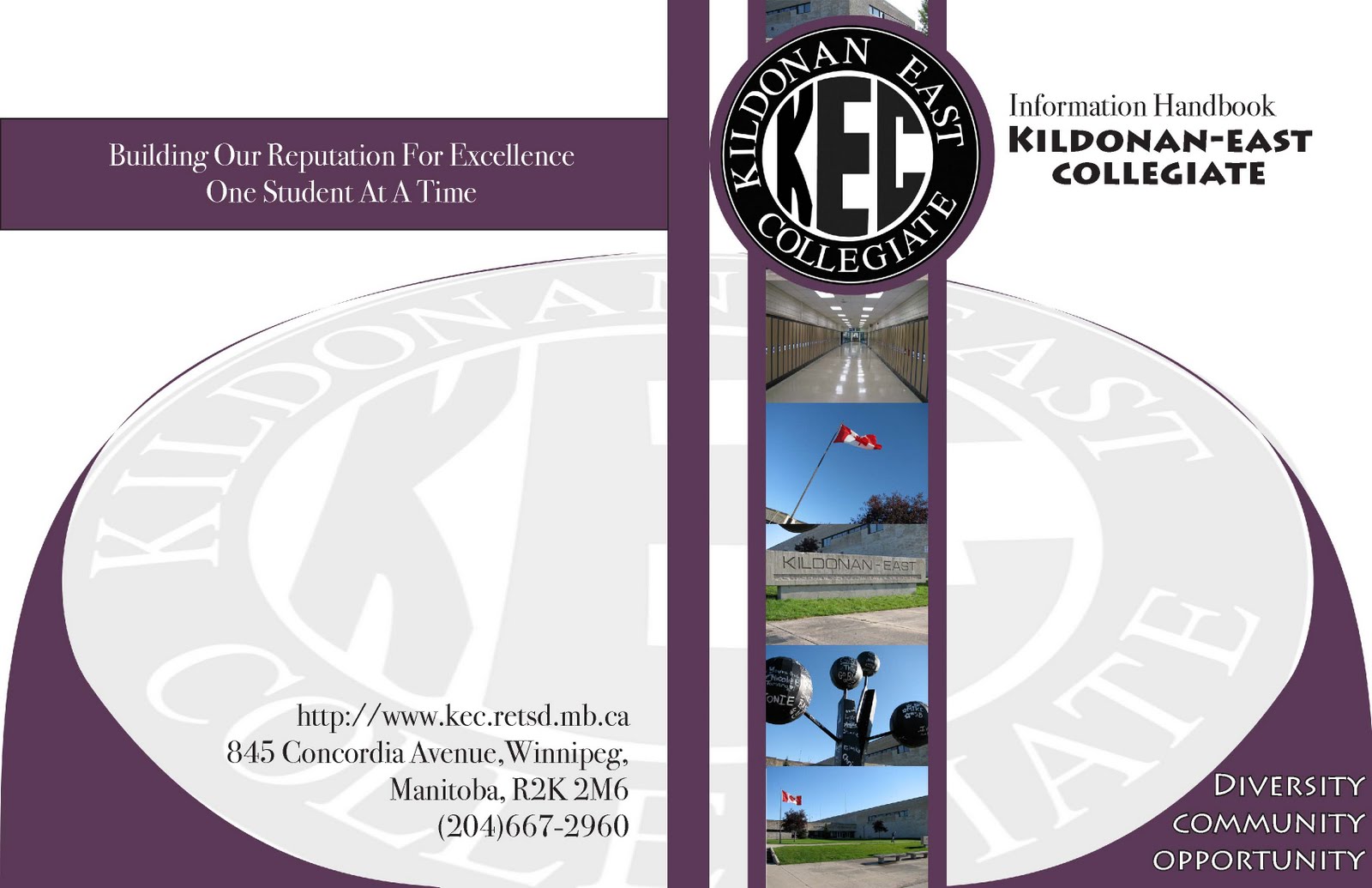 The instructions for this assignment were to create a new cover design for our school information handbook. First, I used photoshop to put the images and shapes in place. I then put it in Indesign to add the font. The color purple was used because that is our school color.
Thursday, June 18, 2009


This is a brochure for the Virgin Mobile Music Festival. I used the Virgin Festival logo a couple of times, I used a VF poster ad, and a concert image that i believe i got from deviantart. Again i don't remember the user to whom it belongs to. Also, i used information from a website about the VF and for the image on the far right i used a couple of Photoshop brushes.


This is an advertisement for a brand called DKNY. The lower body image is taken from the internet. I made some changes in the color with the help of Photoshop. Also the little design underneath the legs was a Photoshop shop brush design, downloaded from a website. :)
Also for some odd reason the colors on this image uploaded inverted. The colors on the real image look different.


Wednesday, April 8, 2009
 This is my 'signature'. In it i put a prince and a princess standing on an open book, which represents the fact that i like to read. I also put pencils because i like art. Another image i put in the signature design was 'tin tin' and his dog 'snowy', and that is there to show again, that i like to read.
Subscribe to:
Comments (Atom)